Read update
- Kieron Quinn has shared more screenshots of this new Play Store interface, including the search UI, and Music store.
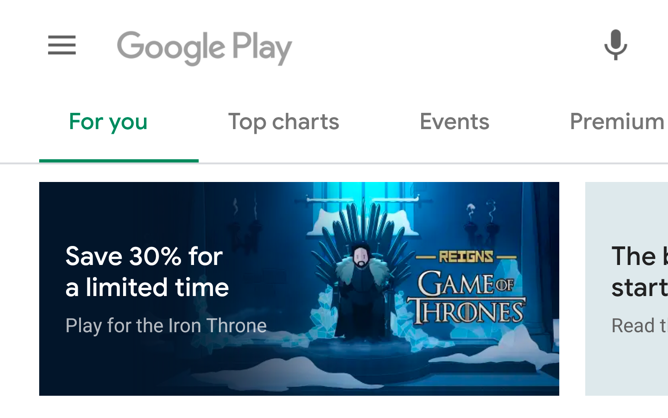
Google has been busy refreshing the Material Design in its apps recently, and the Play Store seems to be among the next ones to get the treatment. Both 9to5Google and one of our tipsters has uncovered the new interface in the latest build by activating a feature flag, which hints the software is about to get a makeover.
The new interface follows Google's Material Theme, featuring more rounded elements and a bottom bar. Just like in the previous version, the latter provides quick access to Games, Movies & TV, and Books, but has taken the Music shortcut away. The underlying sections still appear at the top of the screen but have now lost their icons. The top search bar has also been revamped, as it's now more rounded and reads "Search for apps & games / Books / Movies & TV" instead of the Google Play logo, which makes it easier to identify the section you're browsing. Lastly, when going through a list, the More button has now been replaced with an arrow, which frees up some space on the screen and makes it look less cluttered.
When viewing an app's page, the focus is put on what matters. As such, the install button now spreads across the entire screen width, with less relevant information like the category and tags appearing under the screenshots. The progress bar has also been replaced with a circle around the app icon that fills up as the download completes. To finish, a Permissions shortcut has been added to the Installed tab under My Apps and Games, which makes it easier to see what software has access to what.
We'll keep you posted once this new design starts rolling out to users.
UPDATE: 2019/05/06 4:07am PDT BY RITA EL KHOURY
Kieron Quinn has shared more screenshots of this new Play Store interface, including the search UI, and Music store.
Source: 9to5Google, @Quinny898
Thanks: Kieron Quinn