The switch from the older Material Design to the new one, known as MD 2.0 or Material Theme among Android fans, has been a long process. Some apps like Photos adopted the change swiftly, while others like Maps have gone through small iterations, adding elements step by step. But those changes had yet to affect the web interface of Maps — until now that is. Some users are starting to see a new look, though it's still limited to parts of the UI.
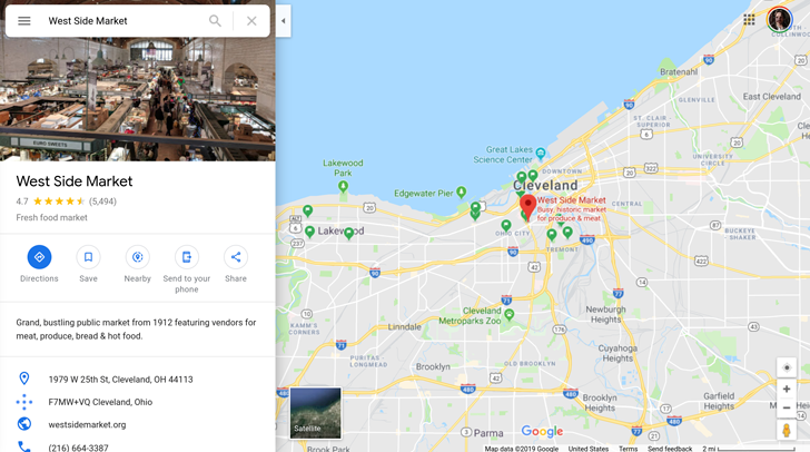
The most glaring change affects place listings, which have lost their large blue card background. Instead, the main photo is a little taller, the name is bolder, and rating stars are yellow. Quick access icons are also rounded now, with smaller grey text instead of the blue capitalized one. The directions icon has moved there too, so it's no longer a floating button, but it's still easy to spot thanks to its filled blue color.
Left: Existing place listing design. Right: New design.
But perhaps the more subtle change affects the search bar on top. It gets rounder corners and, when tapped, the location and close icons are inside a large blue button. Text font and color seem to be changed a little as well.
Left: Existing search bar design. Right: New look.
But not everything is different in the new interface. Many elements are still the same, like the side menu or the main homescreen with its home/work icons and search filters.
Most of the interface still looks the same though.
This change is rolling out server-side to some users — only one of us at Android Police seems to have it. It's likely that the interface will go through several iterations, like the Maps app on Android did, until most of it is updated for the new Material look.
Thanks: Hannes